今回は簡単にコピペで出来る!
楽天 スマートフォンのページ(カテゴリページ)をより使いやすく回遊性が
良くなるよう改善してみたいと思います。
目次
1.下位カテゴリを強制表示&表示カテゴリをコンパクト化
カテゴリを絞り込むボタンが見逃しやすくあまり機能していない
従来の下位カテゴリ表示の問題点
- 下位カテゴリは、「カテゴリページを絞り込む」ボタンをタップしないと、表示されない
- 「カテゴリページを絞り込む」のボタンは見逃しやすい位置にある(商品一覧の情報に目がいきやすい)
- 表示させた下位カテゴリも、表示領域が大きくページの全体を覆ってしまい、カテゴリ全体を確認しずらい
下位カテゴリを強制表示&コンパクトに2列表示
- 「カテゴリページを絞り込む」をタップせず、下位カテゴリ強制表示
- 「カテゴリページを絞り込む」の部分をボタンではなく、タイトルバーに見える様にデザイン変更
- 表示させた下位カテゴリはコンパクトに2列表示
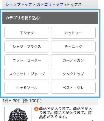
※カテゴリ名が長い場合は、末尾に…で省略される仕様になっています。
変更方法
[css] ※楽天GOLDにCSSファイルを作成後、以下を追加
/* カテゴリを絞り込む 強制表示 */
.sCLToggleCont {
	display: block !important;
}
/* カテゴリを絞り込む デザイン変更 */
.sCLToggleTr{
	display: block;
	background: #666666; /* 背景色変更 */
	border-top: none;
	border-bottom: none;
	color: #ffffff; /* 文字色変更 */
	font-weight: normal;
}
/* 表示カテゴリを2列表示 */
.sCLToggleCont .ilistnon {
	padding: 10px 4px 5px 4px;
}
.sCLToggleCont .ilistnon li {
	box-sizing: border-box;
	width: 50%;
	float: left;
	border-bottom: none;
	padding: 0 3px 6px;
}
.sCLToggleCont .ilistnon li a {
	display: block;
	width: 100%;
	background : none;
	box-sizing: border-box;
	border: solid 1px #bebebe;
	border-radius: 5px;
	margin: 0;
	padding: 10px 5px;
	color: #333333;
	font-size: 12px;
	text-align: center;
	overflow: hidden;
	white-space: nowrap;
	text-overflow: ellipsis;
}
.sCLToggleCont .ilistnon ul:after {
	content: " ";
	display: block;
	height: 0;
	clear: both;
	visibility: hidden;
}
※RMSのカテゴリページ共通説明文に下記の記述を追加する
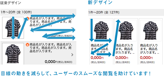
2.ウィンドウショッピング形式(3段組 or 2段組 レイアウト)に変更
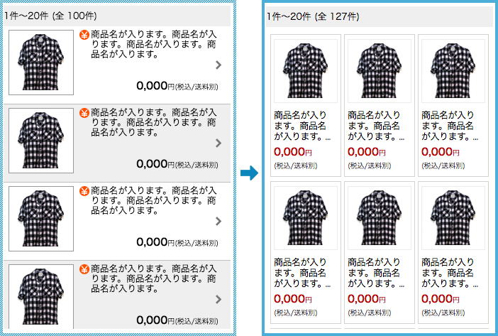
その効果は?
変更方法
[css] ※楽天GOLDにCSSファイルを作成後、以下を追加
#sCSLContainer  {
	box-sizing: border-box;
	width: 100%;
	padding: 10px 0 15px;
}
#sCSLContainer > a {
	display: inline-block;
	box-sizing: border-box;
	width: calc(100% / 3);
	vertical-align: top;
	padding: 0 2px 3px;
}
#sCSLContainer > a > div {
	box-sizing: border-box;
	display: inline-block !important;
	width: 100%;
	height: auto !important;
	background: none #ffffff;
	border: solid 1px #d2d2d2;
	padding: 6px 4px;
	margin: 0;
	overflow: hidden;
}
/* 商品画像部分 */
#sCSLContainer .inLeft {
	width: 100%;
	margin-bottom: 5px;
}
#sCSLContainer .inLeft img {
	width: 100%;
	border: none;
}
/* 商品名・価格部分 */
#sCSLContainer .inRight {
	padding: 0;
}
#sCSLContainer .inRight .txtheight {
	height: 55px;
	min-height:auto;
	margin-bottom: 5px;
	padding: 0;
}
#sCSLContainer .inRight .ctgItemNormal{
	background: none;
	position: relative;
	height: 100%;
	padding: 0;
	font-size: 12px;
	line-height: 18px;
	word-wrap: break-word;
	overflow: hidden;
}
#sCSLContainer .inRight .ctgItemNormal:before,
#sCSLContainer .inRight .ctgItemNormal:after {
	position: absolute;
	background-color: #ffffff;
}
#sCSLContainer .inRight .ctgItemNormal:before {
	content: "...";
	bottom: 0;
	right: 3px;
}
#sCSLContainer .inRight .ctgItemNormal:after {
	content: "";
	width: 100%;
	height: 100%;
}
#sCSLContainer .inRight .txtprice {
	height: 46px;
	padding: 0;
	color: #bf0000;
	text-align: left;
	font-size: 1rem;
}
#sCSLContainer .inRight .txtprice span:nth-child(2){
	font-size: 9px;
}
#sCSLContainer .inRight .txtprice span:last-child {
	display: block !important;
	color: #333333;
}
#sCSLContainer .txtprice .shippingCost_free {
	width: 50px !important;
	margin-left: 0;
	padding: 2px 0px 2px 3px !important;
	font-size: 10px;
	line-height: normal !important;
	letter-spacing: 1px;
	text-align: center;
}
※商品名が長い場合は、末尾に…で省略される仕様になっています。
※楽天の仕様変更や、表示内容により、表示が崩れる場合がございます。予めご了承ください。
また、基本的にこちらは商品画像が正方形の場合を想定しています。
正方形ではない場合は、下記のcssを追加してください。(高さを90pxで固定します。)
#sCSLContainer .inLeft img {
	width: auto;
	height: 90px;
}
※RMSのカテゴリページ共通説明文に下記の記述を追加する
まとめ
いかがでしたでしょうか?
今回紹介したものは、カテゴリや商品数が多いショップさんには
特に相性がいいと思います。ぜひお試しください!
みなさまのお役に立てばいいなと思います!
【楽天スマホまとめ】
[第1回]フローティングバナー設置編
[第2回]カテゴリページ(商品一覧ページ)をカスタマイズ編 ←今ここ
[第3回]css裏ワザテクニック(看板画像・共通バナー)編
[第4回]疑似要素「:before」「:after」を使ったcss裏技テクニック
[第5回]楽天スマートフォン施策まとめ 編